FloWish
FloWish is a mobile app designed to streamline flower ordering, making it effortless to send beautiful arrangements for any occasion. Users can browse curated bouquets, personalize their selection, and enjoy seamless delivery – all from their smartphone!

This case study delves into the design process of FloWish, a mobile app that simplifies flower delivery. As the lead designer,My approach was following the principles of design thinking and user centered design with an iterative design process.
This involved collaborating with a florist entrepreneur to ensure the app catered to both user preferences and floral industry considerations. We'll explore the key design decisions made, the user research that informed them, and the iterative improvements implemented to create a user-friendly and engaging flower delivery experience.
Type
(End-to-End)
UX/UI Design
Usability Testing
My Role
Lead Design
Researcher
Product Designer
Duration
3 Months
Android App
Tools
Figma
Figma
Miro
Notion
Discord
Procreate
Skills
Product Design
User research
Competitive Analysis
Design thinking
Journey map
Sitemap
Persona
Sketches
Prototyping
Lo/Hi-Fidelity
Usability Testing
Context
A passionate florist entrepreneur approached me with the vision of creating a mobile app to give her business a boost.
R&D
Our kickoff meeting established the foundation for the project. We explored crucial aspects like:
Business Objectives: Deep-diving into the entrepreneur's vision and desired outcomes for FloWish.
Value Proposition: Defining the unique benefits FloWish offers to customers compared to other options.
Competitive Landscape: Analyzing existing flower delivery apps to discover opportunities and differentiation strategies.
Target Audience: Clearly identifying FloWish's ideal users, their needs, and pain points.
We also solidified the project framework, including:
Team Structure: Establishing the team members involved in creating FloWish.
Budget and Timeline: Setting realistic financial constraints and a development schedule.
Deliverables: Defining the specific outputs expected throughout the project.

Market Analysis
The flower delivery market is booming! With more people online and busier schedules, sending flowers as gifts has become increasingly popular. We conducted a market analysis to understand this industry, focusing on key areas:
Market Trends: Understanding the overall growth and driving factors.
Consumer Needs: Who are the flower senders and receivers?
Distribution Channels: How are flowers currently delivered?
Competition: Who are the other players in the market?
Floriculture: Insights specific to the flower industry.
Easily browse the latest trending flowers and discover new favorites.


Methods
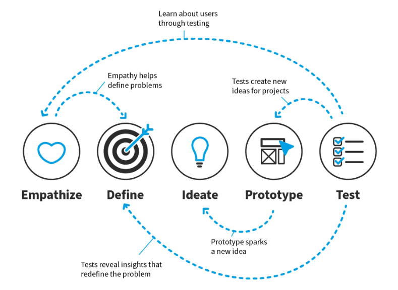
Adopting Design Thinking
To prioritize user needs at every step, we used design thinking. This approach breaks down the design process into five key stages: Empathize, Define, Ideate, Prototype, and Test.
Empathize
To understand who our users were and what they wanted, employed a multi-method approach to gather both qualitative and quantitative data.
Online Surveys: We sent out surveys to a broad audience to learn about demographics and preferences.
User Interviews: We talked in-depth with potential users about their flower-buying habits, pain points, and what they liked.
Personas: Based on this research, we created user personas to represent our key-target users.
Quantitative data collection (Surveys)
We conducted online surveys on multiple social media platforms. After 72hrs, we received 140 surveys results which gave us a better understanding for our users needs.
Regarding online shopping behaviors, 89.4% of purchases preferred cut flowers, 50% people surveyed purchased flowers every few months and on average 44.4% of those people spent $26–50 compared to 37.3% that spent $1–25.
The survey showed that most people interested in buying flowers are between 25-45 years old (40-50%) or 45-65 years old (30-40%). Mostly, it's women (70-80%), and they come from different income levels – around 40-50% have medium incomes, while 30-40% have higher incomes.
89.4%
of people purchases preferred cut flowers
50.0%
of people surveyed purchased flowers every few months
44.4%
of those people spent $26–50 on every purchase
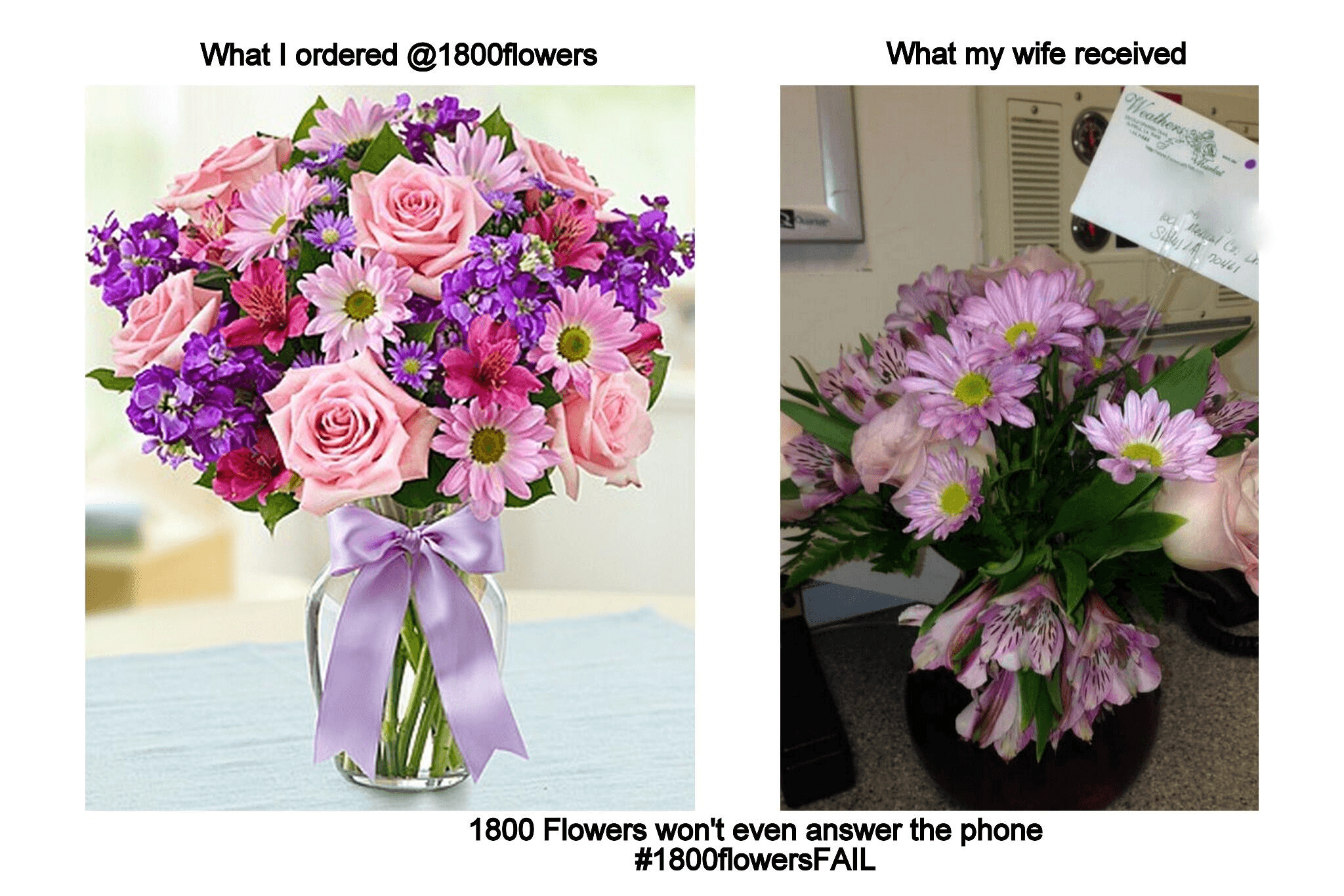
KT#1 The Gap Between Expectation and Reality
A key concern for users was the potential mismatch between the flowers pictured on the app and the actual delivery. Unlike physical stores where you see what you buy, online flower purchases rely on images. This can lead to disappointment if the delivered flowers don't live up to expectations.
KT#4 Pinpointing focus group for user research
The survey data helped us identify groups of potential/user focus group for in-depth research. Through interviews and observation sessions (in the following step), we could gain valuable insights into their diverse needs and preferences
KT#2 Price and Convenience Matter
Users also cared about affordability and ease. They expected competitive pricing and fast delivery from an online flower app compared to traditional stores.
KT#3 Diverse User Base
Our surveys revealed a diverse user base for FloWish, including:
Social media enthusiasts: People who are active on social media platforms.
Gifting enthusiasts: Individuals who enjoy giving gifts for various occasions.
Local community members: People who want to support local businesses.
Couples planning weddings: Users who need flowers for their wedding events.
Event planners: Professionals who organize events that require floral arrangements.

Qualitative data collection (User interviews)
After finding potential focus groups through surveys, we interviewed 10 carefully chosen participants who matched our target audience. These user interviews aimed at exploring user behavior, needs, motivations, goals, and pain points related to flower ordering and delivery.


Sorting and Analyzing data
Our user interviews revealed valuable insights into what motivates and frustrates our target audience when it comes to flower delivery as follows:

Appearance
Users expect to receive the exact product as in the picture on the app.
Cost
Users expect better prices online compared to traditional flower shops.
Convenience
Users want to be able to order their flowers quickly and easily.
Product Quality
Users want fresh, high-quality flowers, replicating the experience of choosing them at a florist.
Variation
Users want a wide variety of flower arrangements, with the option to customize them, similar to a physical store.
Trust
Users prioritize trust and reliability when buying flowers online.
Creating Persona
Through interviews, surveys, and other research methods, we gathered valuable insights from potential FloWish users. By analyzing this information, we created four user personas. These personas act as fictional characters representing the different types of people who might use FloWish.Each persona has a detailed profile with their goals and needs. This helped us understand the various reasons people might use FloWish.
Problem, Challenges and Goals
Problem Statement
Finding the perfect flowers for special occasions can be frustrating and time-consuming. This could be outlined into four main issues:
Limited Choice
Traditional flower shops might not have the specific or unique blooms users are looking for.
Inconvenient hours
Physical stores may have limited operating hours, making it difficult to find the right time to shop.
No Customization
Traditional shops often lack options for personalizing bouquets to match specific event themes.
Time-consuming Search
Users might have to visit multiple stores due to limited selection, wasting time and effort.
Key Challenges
Building user trust, creating a seamless ordering experience, catering to a variety of needs, and efficiently handling large orders are key challenges for the FloWish app.

Main Goal
FloWish goal is to offer a more accessible, personalized, and convenient way to send beautiful flower arrangements. This can be translates into three objectives:
OBJ #1
Offer a wide range of unique arrangements users can send for any occasion.
OBJ#2
Make it easy for users to find and customize the perfect flowers.
OBJ#3
Provide a convenient mobile platform for a hassle-free experience.
Process
Customer Journey Mapping & Storyboarding
To gain a comprehensive understanding of user needs and identify potential pain points, I opted for an, in-depth customer journey mapping exercise. This approach focused on:
Visualizing the Traditional Experience: I mapped a user's journey through a physical flower shop. Here, I documented common frustrations like limited selection, time constraints due to store hours, and a lack of customization options.
Contrasting Online vs. Offline: I then mapped a contrasting user journey for online flower shopping. This exercise highlighted the inherent convenience of ordering and delivery compared to the limitations of physical stores.

To visualize user interaction with the FloWish app, we embarked on a storyboarding exercise. This involved:
Ideation and Big Picture Thinking: We brainstormed a wide range of ideas, considering the overall app structure and functionalities that would best cater to user needs.
Refining the Details: Moving beyond the big picture, we then zoomed in on specific user flows and micro-interactions within the app. This ensured a seamless and intuitive experience for all users.
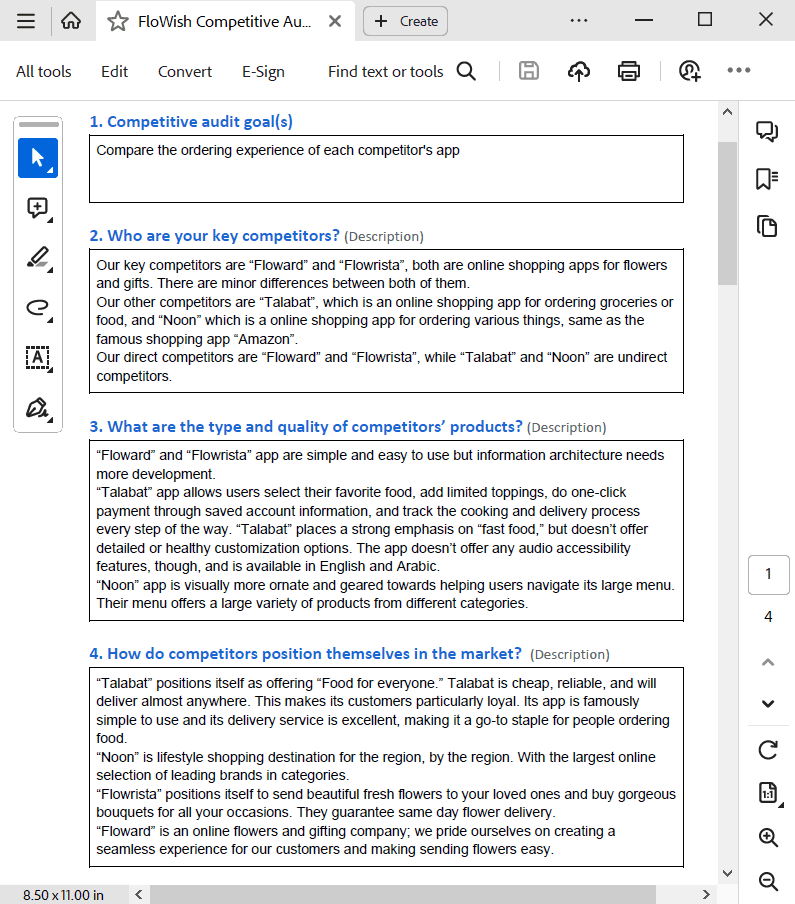
Competitive Benchmarking
Conducting Competitive Audit
To understand the existing user experience, I checked out both big names and new players in the market to see who FloWish competes with most directly. We also found two other companies offering similar things to FloWish, even though they're not exactly the same type of business. Competitive analysis is considering value proposition, target audience, content, first impressions, and interaction.


Synthesis
Data to Card Sorting
To gain a holistic understanding of user needs, I leveraged a variety of research methods, including the Competitive analysis, SME (Subject Matter Expert) Interviews to gain insights from industry professionals, surveys, Brainstorming sessions and Tree-jacking to assess user navigation patterns within existing flower delivery platforms.
Faced with this rich dataset, I employed card sorting to delve deeper and uncover key themes and patterns. This method allowed us to:
Identify user desires: Identify key themes and recurring needs within the customer data.
Uncover hidden connections: Discover previously unseen relationships between different user needs.
Prioritize for design: Use user feedback to prioritize areas for focus within the app's design and functionality.

Ideate
Feature Ideation
I put together a list of important features for the first version of the FloWish app. Before moving forward with our low fidelity design, I used a feature matrix to determine the important features the ecommerce Mobile app should have — we sorted based on Value and complexity in order to come up with the MVP while keeping in mind what our persona wants.


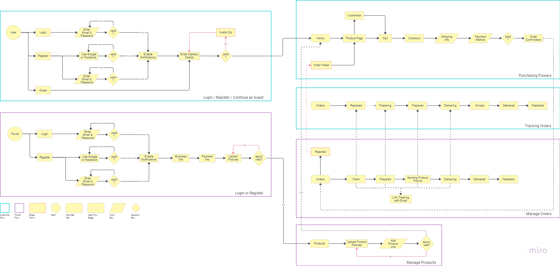
Creating User Flow
From there I moved forward in conducting User Flow for Flowish app where all pages were identified and ultimately created for the mobile app. I tried to design a convenient user flow by an ordering process with the minimum clicks possible.
Prototype
Generating Wireframes
After I defined the user flow, I prefer to create paper wireframes before I move to my computer. The wireframes of FloWish app focused on five (5) key elements — appearance, cost, convenience, product quality and variation.
I like to create paper wireframes before I move onto my computer. It's a faster and more effective way of recording ideas. Especially the ones that don't make the cut to the final project, this helps me make decisions on the structure of my product early. Sometimes I would go a step futher, cut of each screen from paper and play around with the "paper app" this really helps visualise the dynamic of the product.

Usability Testing
Testing Prototype
To test the prototype. I have invited 10 people from the target demographic to my moderated, usability study. Prior to the study, I set the research goals and other key usability study factors (detailed plan below). I wanted to make sure the participants feel comfortable sharing their honest opinion which is very valuable to me. In my intro to the usability study, I let my participants know that there are no right or wrong answers. I have also asked open-ended, neutral questions to avoid leading and bias to get detailed and honest feedback from participants.
Overall my participants found the product easy, smooth, and very intuitive. During the usability study, I updated a detailed spreadsheet with each user's feedback, their click path, task completion, and comments. Completing these steps allowed me to organize all the data I have conducted from my participants and use it to learn about any improvements I should focus on.
My goal was to test if users can complete tasks within the mobile application, how pleasant was the process of completing the user flow? and figure out if there are any specific difficulties they could potentially encounter


Participants' selection criteria:
Participants are anyone who buy flowers at least once a year
Participants need to reside in a big city.
Participants should be between 17-65 years old.
Participants should include a fairly even distribution of genders across the spectrum.Incentives: a $15 electronic gift card to a Coffee Shop.
Methods: Unmoderated usability study.
Location: Egypt, remote (participants will go through the usability study in their own homes).
Ten participants were asked to order a flower bouquet through the app. · Each participant was asked to complete a questionnaire on his/her experience afterwards ·
Duration: Each session will last for 20-30 minutes (including testing and answering follow up questions). Sessions took place between September 16-18, 2021. ·
Key Performance Indicators KPIs:
Conversion rates — measuring how many people had actually completed the bouquet order. ·
System usability scale — measuring how pleased the users are with their experience within the app. ·
Time on task — measuring how much time users spend ordering a bouquet.
High Fidelity
Two rounds of hi-fi wireframe iterations
The hi-fidelity wireframes for the FloWish app underwent two rounds of iteration. The initial design prioritized a functional and goal-oriented approach, aiming for a streamlined user experience. However, user testing revealed a preference for a simpler and more intuitive interface. This valuable feedback prompted a redesign that emphasized clarity and ease of use over extensive functionality.

Accordingly, I completely revamped the design for the second iteration aiming at achieving a more user-friendly and efficient experience, based on the key takeaways I collected as follows:
Prioritizing Ease of Use: Multiple participants commended the app's intuitiveness and streamlined design [A, E]. This feedback reinforced the focus on simplicity and clarity for future iterations.
Pre-designed Bouquets as a Preference: A significant portion of users expressed a preference for pre-designed bouquets over building their own, suggesting a need to emphasize curated options [A, B, D, F].
Order History and Status Importance: Participants appreciated the app's functionality for managing order history and status, highlighting the value of clear order tracking features [B].
Addressing Usability Issues: User testing identified minor usability concerns. These included difficulty locating the order status page [D] and inactive buttons [D]. Additionally, some users preferred utilizing pre-designed bouquets [D, J]. This feedback provided a roadmap for further refinement of the user interface and interaction design.
Button Color Preferences: Button color received negative feedback, with users finding the current options unappealing [C, G, H]. This prompted a design revisit to explore a more visually pleasing color palette.

Results
Learned Outcomes
The Flowish app UX case study highlights the power of user-centered design. By prioritizing user needs, conducting thorough usability testing, and implementing best practices, the app delivers a delightful user experience that is both accessible and commercially successful
Understanding Flower Power Users
Diverse Needs: User research revealed a variety of user personas, from budget-conscious buyers to last-minute gifters. Each persona has unique needs for browsing, selection, and delivery options.
Accessibility Matters: Voice search implementation caters to users with visual, motor, or learning disabilities, expanding the user base and promoting inclusivity.

Data-Driven Design
Learning from Mistakes: Early testing of complex features, like flower customization options, helped simplify the process and improve task completion rates.
Voice Search Success: User testing with the target audience ensured the voice search feature was intuitive and effective, enhancing accessibility.
Conversion Rate Climb: Focusing on user needs and implementing a user-friendly design led to a significant increase in conversion rates, demonstrating the business value of UX research.
Optimizing the Flower Journey
Usability Testing Wins: Iterative usability testing identified and addressed pain points throughout the design process. This ensured a smooth user experience from browsing to checkout.
Personalization Power: Profile customization allows users to save preferences and streamline future flower purchases, boosting engagement and loyalty.
Finding Floral Bliss: A clear and intuitive navigation bar guides users effortlessly to their desired flowers and features, reducing frustration and encouraging exploration.
Future Considerations
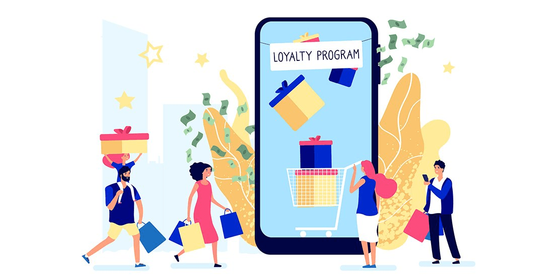
Loyalty Rewards: Explore integrating a loyalty program to incentivize repeat purchases and reward loyal customers.
Live Chat Support: Consider implementing a live chat feature to address user questions and concerns in real-time, further enhancing the customer experience.